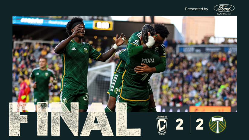
Before the U.S. and Belize opened the 2013 CONCACAF Gold Cup in Portland, Oregon, the Timbers Army and American Outlaws unveiled a massive series of banners that featured ‘Cascadia Sam’ and the words ‘Community,’ ‘Club’ and ‘Country.’
“For a number of us it was this gigantic epiphany,” MLS chief marketing officer Howard Handler told SI.com. “It hit us square between the eyes. This was the very best of what the league can deliver.”
So writes Brian Straus in Sports Illustrated as Major League Soccer attributed part of the inspiration for the design of the new league crest. As MLS looked to redesign and rethink the next stage of their league crest, that intersection of community, club, and country became a key rallying point or, in the words of MLS senior director of brand and integrated marketing David Bruce, "enduring guideposts."
Simon Borg on MLSsoccer.com has more on the Portland connections:
In the final design, the shield has three stars in the upper left corner signifying the importance of community, club and country to the ongoing evolution of the league. And with those three stars, the crest is also a direct connection to that memorable night and popular ethos in Soccer City, USA.
Learn more about #MLSNext on MLSsoccer.com then read Straus' full article on SI.com here.