On the back of a successful 2013 season, the Portland Timbers introduced today two special kits to help carry over excitement into 2014. Rooted in the past but with an eye toward the future, the club has collaborated with adidas to develop a daring and innovative secondary kit for the Timbers along with a new but based-in-tradition third kit.
With adidas' North American headquarters just four miles from Providence Park, the kit design process in Portland was a collaborative effort that took advantage of familiarity and Rose City civic pride. The kits also make use of the innovative adidas adizero fabrics. Using the world’s lightest materials, the kits provide the Timbers with maximum on-field performance. The 2014 adidas secondary kit is 25 grams lighter than the previous secondary kit, reducing overall weight by 14%.

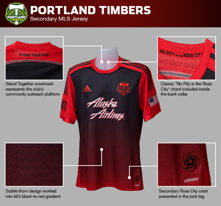
When designing the team’s new secondary kit, adidas took a new approach and introduced a new design element for the Timbers. In a dramatic reimagining of the club’s Rose City Red concept, the new secondary kits feature a black-to-red gradient pattern highlighted by sublimated rose stems. The result is a look never before seen in Major League Soccer but one that holds true to the city’s claim to fame as the City of Roses. 2014 marks the fourth consecutive season in which the Timbers will use red in their secondary kit, a tradition that encompasses the entirety of the club’s MLS era. There is also a connection to the club’s USL-era when the team utilized a rose-colored edition as far back as 2008. The new 2014 kits reference the team’s past across a variety of eras while maintaining continuity in the team’s current form.
“The secondary kits are a modern, energetic design meant to reference the city’s famous rose gardens,” explains adidas global product manager for MLS, Mike Walker. “Some roses that are just about to bloom have a blackish red color that fades to a bright red. We took a closer look at that and thought those roses were much like the Timbers, new and ready to bloom.”
Red sleeves and shoulders maintain the more the more traditional aspects of the Timbers’ secondary kits and include a Stand Together wordmark on the back. Referencing the team’s charitable arm, Stand Together holds a significant place in the club’s ethos and unites the two new kits with prominent displays. Stand Together, which has won the MLS Community Relations Department of the Year award the last two years, debuts on the exterior of Timbers kits this season, having previously featured on the inside of the primary kit collars.
From the chest to the bottom hem, color shifts from black to red with a bright silver Alaska Airlines sponsorship anchoring the front of the shirt. The thorn pattern helps carry the color transition and gives the shirt a subtle but effective Portland connection. Paired with either black or red shorts and predominantly red, horizontally striped socks, the new secondary kit is instantly recognizable as that of the Rose City. Including black in the secondary shirt and shorts will also remind fans of alternate kits worn in the final two years of the club’s second division era.
“We have been talking with the Timbers about red with black for a couple of years now,” said Walker. “Black is part of the team’s recent history and provides a great contrast with the green and white primary kit.”

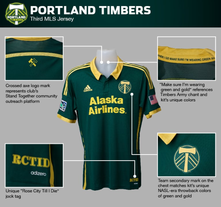
Continuing the connections to the past, the new third kit is reflective of the nearly forty year history of professional soccer in the city. Taking inspiration from the Timbers’ kits from the club’s NASL era and similar to the club’s previous white MLS third kit, the new third kit combines a darker green with true gold—Portland’s earliest color scheme during the NASL period. Reminiscent of the Timbers’ successful teams from the late 1970s, the green and gold design is a reminder that the club’s colors have been a constant from 1975 to the present. The bold collar, secondary crest and inclusion of Alaska Airlines’ retro font connect the current Timbers to the legends of the past.
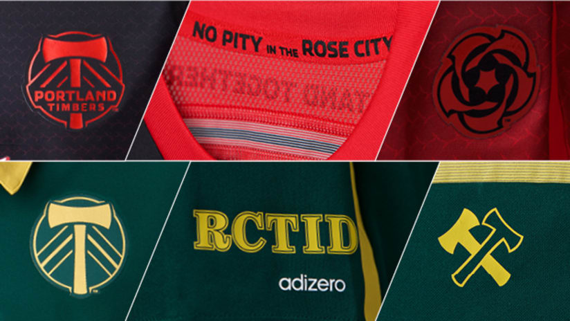
A unique template developed by adidas ensures that the new third kits will keep Portland as the only MLS club in green and gold. The design also includes a reference to the popular chant, "Make Sure I’m Wearing Green & Gold" inside the shirt’s collar, a special RCTID jocktag and a Stand Together crossed axes logo on the back. Thinly striped socks complete the gold-accented monochromatic kit for a classic, unique look.
Both new kits include a design element that ties all adidas kits together in this World Cup year. Across the back, a mesh panel extends the width of the shoulders with a different colored stripe at the bottom. Each adidas kit that debuts in 2014 shares this feature. Portland’s new secondary kit carries the Stand Together wordmark above the stripe while the new third kit features Stand Together’s crossed axe logo just below the stripe.
Portland fans will get to see the new third kits right away as the Timbers will debut the all-green ensemble on March 8 against the Philadelphia Union.
Self-described "kit nerd" Michael Orr is the author of "The 1975 Portland Timbers: The Birth of Soccer City, USA" and is a frequent contributor to the soccer quarterly Blizzard, Stumptown Footy on SB Nation and more.


